Johannesburg architect Anthony Orelowitz has designed a family home that reinvents the notion of the urban refuge;
“In Johannesburg, there is no mountain,” explains architect Anthony Orelowitz…. “There’s no sea either; It refers to Table Mountain in Cape Town, South Africa; Houses in Cape Town generally face outwards, for views of the ocean or Table Mountain;
“Here you have to create your own environment,” explains Anthony;
He wanted to adapt to Johannesburg’s urban character when he designed his own house in the city’s famous wooded suburbs; Anthony is first and foremost a commercial architect; His firm, Paragon, is responsible for some of the city’s most important projects; But, he says, “I hadn’t built a house for nearly 15 years”;
Nevertheless, working closely with architect Elliot Marsden and interior designer Julia Day, he has designed a house in Joburg that is both perfectly suited to the city and completely different from its neighbours;
The land on which Anthony has built his house used to be a tennis court: it was reached by a long driveway surrounded by houses on all sides;
Julia was involved right from the start of the project, so that the ideas behind the design were maintained right down to the smallest detail; She says the house is unlike any she has worked on before; “Everywhere, the details were personalised as we went along,” she says; (She remembers redesigning entire bathrooms so that the tiling was perfectly even, lining up exactly with the doors, without the need to cut or use unevenly sized tiles); The design, engineering, construction and decoration have been a constantly evolving experience;
For his home, Anthony turned to the archetypal atrium house: an interior courtyard surrounded on all sides by the building, creating a peaceful sanctuary at its heart, open to the sky; He describes it as a veritable oasis in the city;
The house is essentially a series of pavilions, with vast sliding doors and screens that can be opened or closed, reconfiguring a mosaic of spaces in countless ways. (A new track system had to be designed to operate the solid glass panels of the sliding doors);
However, rather than simply enclosing the central courtyard, Anthony has “pushed” the landscape into the pavilions and out to the edges of the site; “The floor inside is a single piece from one end of the house to the other,” he explains;
This creates “secondary courtyards” all around the house, where the pavilions open onto private, peaceful spaces under the trees, and where the boundary walls actually become the walls of the house;
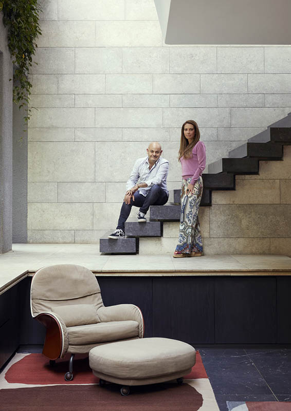
Architect and owner Anthony Orelowitz and interior designer Julia Day;
Despite its long, low appearance, the house also has an upper level in the treetops, carefully designed around the branches that lean into and over the house. It’s like a “big tree house for adults”, explains Anthony; This gives a feeling of space knitted together both vertically and horizontally, drawing you towards the terraces as much as towards the house and gardens on the ground floor;
Anthony designed the house “upside down”, with the bedrooms on the ground floor, nestling under the trees, and the outdoor living and relaxation areas (including the swimming pool, whose portholes at the back overlook the central courtyard) on the upper level. He says that when he wakes up in the morning, he wants to “touch the ground” and “be in the forest”;
The luminosity and apparent simplicity of the design is truly an engineering marvel, from the massive, solid ‘post tension beams’ that wrap around the house (so well hidden by the cascading plants that you can’t see them) to a floating lounge floor suspended by a 90mm steel hanger from the ceiling above which it seems to defy gravity.
Julia explains that the carefully controlled palette of interior finishes has been selected for its natural, tactile and raw aspects; Anthony talks about “sensory feedback” when you touch the surfaces in your home, from the walls to the floors; It’s a quality he finds regenerating; The raw sensuality of the stone, the lushness of the plants and the presence of elements such as air and water move away from minimalist European modernism towards a lush, tropical sensoriality that is typically Brazilian;
The tactile, natural materials bring nature indoors and this ‘feeling’ is reinforced by the way light enters the house, the way air flows over a pond and through a skylight, the movement and variations in temperature…
Particular attention has been paid to detail so that there is no transition between the inside and the outside, a goal often sought but rarely achieved; Wood cladding covers the walls and ceilings, and the door and window frames are integrated with such precision that the thresholds are imperceptible; The lighting (also highly personalised) is concealed and designed so that, in the evening and at night, the quality of light inside and outside is the same; The effect is magical;
Despite the pure beauty of its design, Anthony compares his house to Hogwarts School in the Harry Potter book series, referring to the secret passageways and hidden staircases of this imaginary school; He describes it more as a system than a fixed structure; “There are hidden passages and other hidden spaces behind these spaces,” he explains;
The way in which walls and screens can be opened or closed in Anthony’s home means that it can be magically reconfigured; It is always moving and changing shape; “It’s quite theatrical,” admits Anthony;
Some totally over-the-top features, such as the app-controlled automated skylight (around 20 m long and 3 m wide) that runs the length of the front of the house, add to the magical effect, transforming interiors into exteriors. “The walls are made of plants,” says Anthony, referring to a vertical garden that runs the length of the first floor;
Julia has maintained this sense of surprise and discovery throughout the interior, in particular by concealing cupboards and storage spaces behind wall panels and even entire rooms (the cloakrooms and scullery are hidden behind seamless wall panels); This has the effect of bringing the house back to a comfortable, human scale;
By all accounts, Julia has worked miracles to ensure that all the exteriors and connections are truly habitable, and that the family occupies all the living spaces; She explains that large volumes and open, fluid spaces also need “modules” and “restful corners” that create more intimate spaces; To be relaxing, open spaces must be places where people can “be alone together”;
So, while respecting the architecture in her choice of furniture, she has ensured that the house is as warm, welcoming and soothing as it is surprising and delicious;
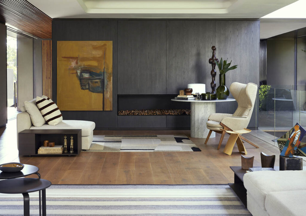
She was largely inspired by the creations of De Padova and brands such as Ligne Roset, Wiener GTV Design and local designers such as Haldane Martin; She points out that not only is the furniture beautiful on its own, but it also works wonderfully together without “competing” with each other; She has favoured low, often lightweight designs, with fairly transparent pieces that do not interrupt sight lines or “break up” views to give a feeling of fluid, continuous space; “There’s nothing to stop you looking,” she says;
But she has also chosen creations that are imposing enough to occupy the space; “La maison autorise des éléments sculpturaux”, dit-elle. Les formes architecturales du mobilier d’extérieur de Haldane Martin, par exemple, ont transporté le langage de la “coque dure” de la maison dans une autre dimension.
Because the space is so interconnected, she had to constantly think about what the furniture would ‘translate’ into the house from different points of view. In the same vein, she steered clear of designs that were “too functional”. The kitchen was conceived more as a convivial space for cooking and entertaining, rather than a traditional kitchen;
The interiors, she emphasises, are an exercise in layering, articulating and complementing architecture rather than decoration. Natural textures are echoed in the fabrics, maintaining a sense of grounded, authentic materiality. Colours are drawn from water, foliage, sky and stone to “make inside and outside a single space”;
To maintain the notion of simplicity, subtle variations in colour texture and materials (the same hammered granite here, but sandblasted there) prevent the whole from appearing monotonous or sterile. She has turned to craftsmanship, the tactile and the imperfect to bring warmth and conviviality to the space;
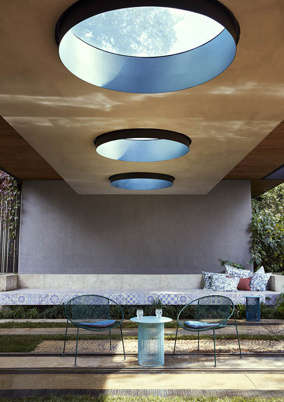
She has even gone so far as to adopt what she calls ‘anti-perfection’, and to make a few deliberate ‘faux-pas’. The patterned tiling in the central courtyard’s outdoor lounge, for example, breaks the rules, but introduces the whimsy and freshness desired for the spirit of the place. Julia quotes Vico Magistretti, who designed a number of her favourite pieces of furniture, some of which she chose for the house: “Simplicity is the most difficult thing to achieve. It’s an effect rather than a set of rules;
But the secret lies in the details, in the ability to maintain a clear vision of the “big idea” right down to the smallest detail. Of course, this meticulous attention to detail only pays off if the idea is convincing from the outset. If it is, you are creating an architectural monument;
A staircase leads from the entrance to the upper level. Another, smaller, staircase leads to the kitchen and dining room, which are slightly sloping, with the edge of the pond at eye level. The baskets beside the pond are from Amatuli. The Louisiana chair, inspired by a saddle, was designed by Vico Magistretti for De Padova. The rug is by Paco, its abstract organic pattern a work of art in itself, especially when viewed from above; Its colours echo the details of the foliage in the vertical garden and the cascading vines. The Vidun table in the dining room was also designed by Vico Magistretti for De Padova. The Korium armchairs by Tito Agnoli for Matteo Grassi belonged to Anthony’s parents. The skylight at the top of the double-volume space opens onto the sky. The floating lounge above is suspended from a thin arch at its corner, giving the architecture an airy, floating character. The granite cladding on the wall behind the staircase is sandblasted, while that on the staircase is hammered, creating subtle variations in materials throughout the house, while maintaining coherence and unity.


The courtyard on the other side of the master bedroom is one of Anthony’s favourite places – a quiet, serene space under the trees; The plants cascade down from the upper level to the ground, creating a curtain of greenery and an almost tropical atmosphere, while cleverly concealing the massive metal beams that allow the architecture to be light, open and floating. The Papa chaise longue and Cha Cha side tables are by Haldane Martin; The Firefly nomad lamp was designed by Alexander Åhnebrink for De Padova; Inside, the wood panelling creates a warm, enveloping atmosphere; The bed was custom-made by Julia; She calls it “sleep island”; It is covered in a raw linen cover made to measure by Heavenly Feather; The bedroom and bathroom open onto their own courtyard, which can also be opened onto the main courtyard or, alternatively, closed off to transform the room into a private suite; The Yak sofa in aniseed lamb leather is by De Padova; The Elementi table lamp was designed by Elisa Ossino for De Padova; The artwork above the bed is by Candice Kramer;
In the main bathroom, which can be opened onto a courtyard between the bedroom and the garden at the back of the house, Julia has designed the marble showers as if they had been “inserted” into the volume; The false ceiling creates a cocoon-like atmosphere; The details are perfect – there’s hidden storage behind the mirrors, for example – and there are no superfluous details. The Paipaï armchair is by Ligne Rose, as is the Globe Indoor lamp. The Estenda coat rack was designed by Busetti Garuti Redaelli. The Sen range of occasional tables is by Kensaku Oshiro for De Padova. The sculpture on the wooden base is by Angus Taylor, represented by Everard Read. The bespoke bamboo napkins are by Heavenly Feather;
The upstairs guest suite opens onto a magnificent bathroom, which can be completely open to the sky thanks to an automated skylight controlled by an app. In the bedroom, the sculpture on the wooden plinth is the work of Candace Kramer. The bespoke bed linen in shades of green is by Heavenly Feather and echoes the plants in the bathroom;
Floating staircases lead from the inner courtyard to an upstairs relaxation area, which Anthony describes as a ‘tree house for adults’, almost like a pavilion in the branches. The large fireplace below was inspired by the fusion of the idea of a fireplace and a room. The balustrades, made of standard square steel tubes, were converted into planters with succulents, transforming something banal into something original;
The relaxation area is furnished with a 0-Plat table and Hula chairs by Haldane Martin. The structure, carefully designed around the branches of existing trees, which lean directly into the space, provides a covered area.
Share this article with your friends


© Copyright 2021 – Homes.mu by Eclipse Investments | Design with ❤ by Mataora.com
Soyez le premier à recevoir les nouveautés de Homes Magazines directement dans votre boite email.
