When James Moffatt and Marc Watson first began searching for a new home, this house in Parktown North, Johannesburg, was the very first one they visited. “As soon as we walked in, we felt it,” says James. They’d been considering building a house from scratch, but were keen to see what else might be available.
“It was weird,” says Marc. “In our minds, this was actually the home we wanted to build.” Nonetheless, it took four more months of house hunting before they realised just how serendipitous their first viewing had been. “Bizarrely, everything we’d hoped for was there,” he says. “We didn’t believe that could happen.”
When they came upon it, architect Kate Otten had recently altered it for the previous owners. She says that, while it had some original features of the 1930s servicemen’s houses typical of the area before she began, it had previously been altered and altered again until it had become “a bit of a rabbit warren”. Her task was to “strip out the complications” and make sense of the interior spaces.
“What I love about alterations is untangling or rewriting the meaning of a house,” says Kate. “Often, one bold move can rescript everything.”
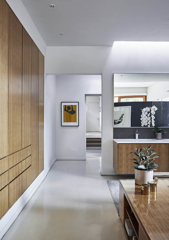
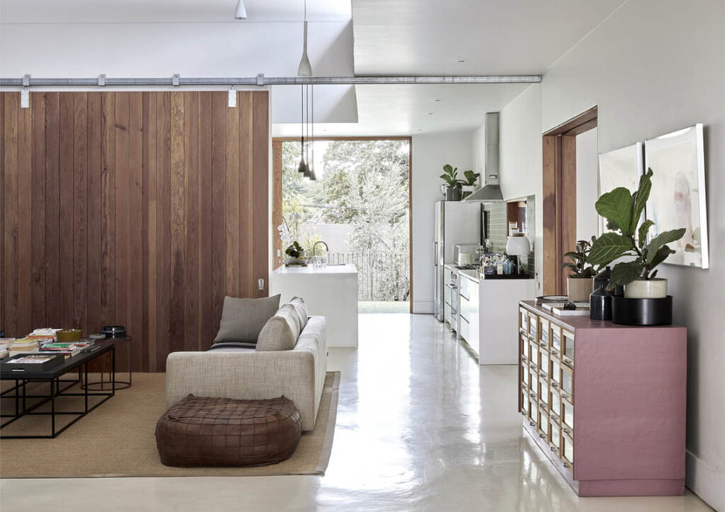
Like James and Marc, the previous owners were keen art collectors, so the defining feature of the house as you enter is a long gallery that runs through its centre. “From the front door, you can see all the way through to the back of the garden,” says James. In contrast to the dark, graphite-coloured walls of the exterior, inside it’s a pristine white canvas: an invitation to fill the walls with colour.
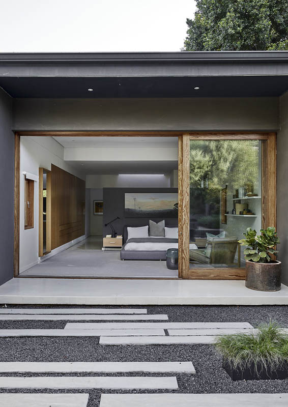
The house itself is arranged in two wings on either side of the gallery’s axis or spine, which mediates between the private bedroom areas and public living areas. The bedroom wing can be completely closed off from the rest of the house, and still has its original pressed-metal ceilings and proportions. The low volumes and separate rooms here – where Marc and James have not just their bedroom, but also guest rooms and a study – create a sense of intimacy.
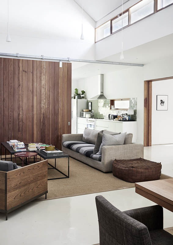
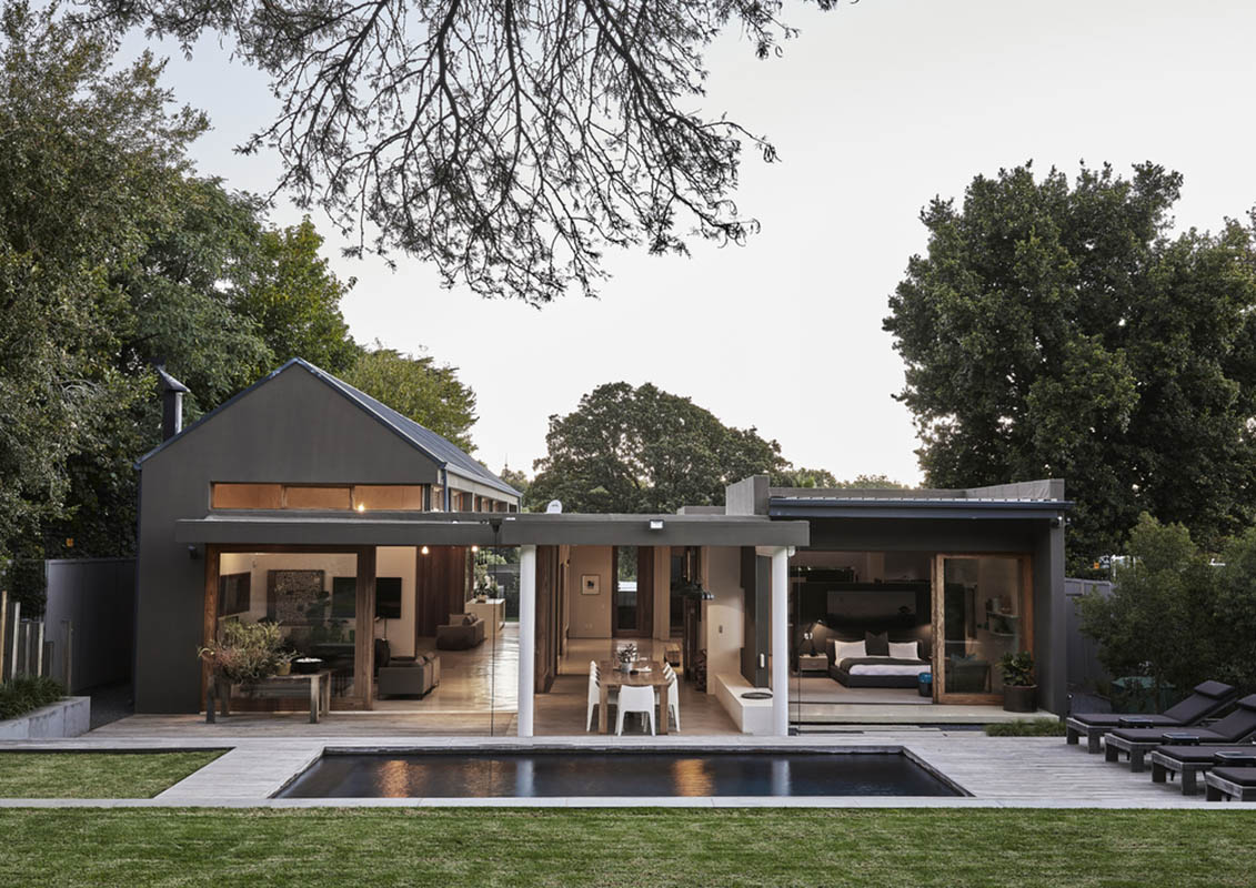
To the other side of the gallery is a large barn-like living area with the kitchen, TV room, lounge and dining room. Its clean pitched ceilings and a deft choreography of volume and light create a wonderful open atmosphere with a more social character.
The variations in scale and volume are an absolute masterclass in the manipulation of proportion. The combination of space, volume, proportion and the quality of light are central to the experience of this house. “The way light falls is how you make spaces come alive,” says Kate. “Too much light can kill a space. Enough light creates a mood.” She’s also been aware not just of the views, but of how people see things – “How your body is positioned in relation to the views,” she explains.
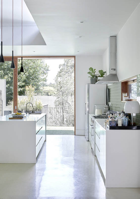
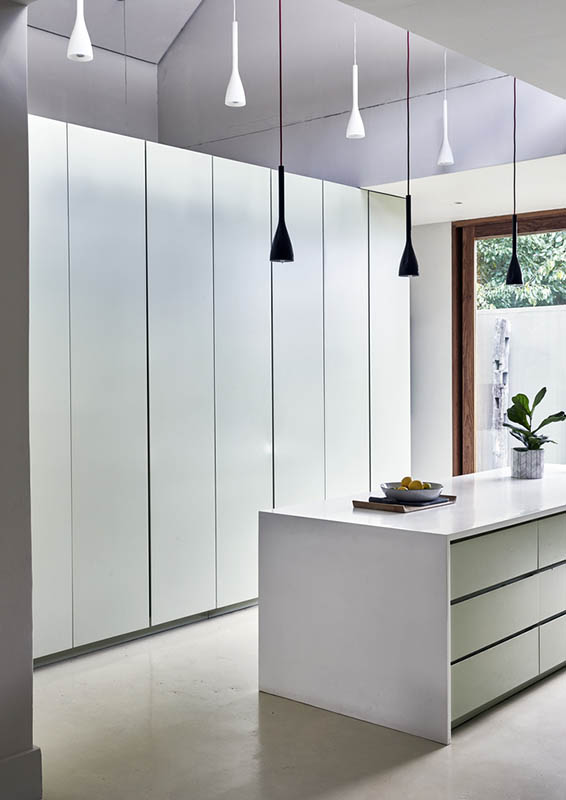
Throughout the house, she’s let in light not just through the huge floor-to-ceiling sliding doors that open to the garden, but also through clerestory windows, skylights, eye-level openings such as those in the kitchen and lounge, and a series of odd-shaped and -sized windows along the northern wall.


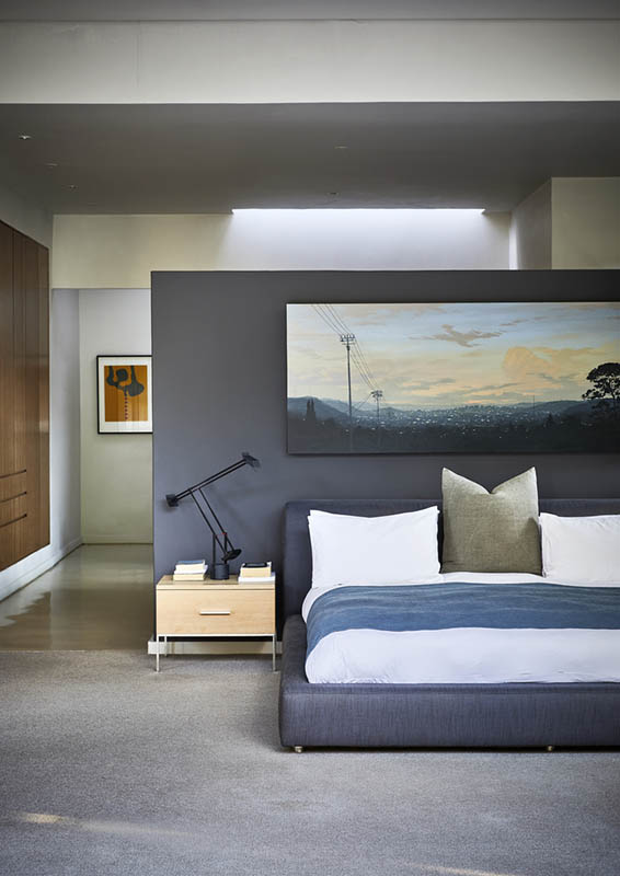
Moreover, the use of light is designed to create a sense of connection to the movements of the sun throughout the day and the seasons. “The skylights in the gallery punch pools of light from above that move as the sun moves through the day,” says James. The light becomes a dynamic sculptural element in the architecture. Another hidden skylight in the en suite bathroom of the master bedroom washes the mirror and vanity with light from above.
Kate’s awareness of how scale and volume affect a person’s experience of space is central to her approach. The high volumes never feel cavernous and the low volumes are never cramped. The large volume of the living space is flexible; the barn shape can both be divided and connected with a series of enormous top-hung Oregon pine sliding doors, which, as they’re moved, create morphing meandering paths between the kitchen on one end of the house and the patio on the other.
The choice of Oregon pine is a reference to the sprung floors the original house had in past. “When we first came here, it was cold and as we walked in we were met with the lovely warm scent of the wood,” recalls James. Other materials, such as corrugated iron on the wall outside that you can glimpse through the windows, and which would have been the home’s original roofing, have also been given a contemporary reinterpretation.
Although their art collection followed them from previous homes, Marc and James pretty much started afresh with the interior of their new home, the furnishings are a response to the house as much as to their own evolving taste. “There’s something quite wonderful about just letting go of things and thinking about what you want a new space to be like,” says Marc.
“For us, it’s really important to create a living space that aligns with how we feel around design,” says James. It’s Marc, however – the art director of the advertising company they run together who took the lead in the home’s interior design.
It’s an eclectic mix. “There’s no real approach – it’s a bit of a mish-mash,” says Marc. “I believe a home should be accidentally beautiful. I don’t want to overthink anything. If I think something is wonderful and it brings me joy, it needs to find a place.”
But, as much as James and Marc appreciate design, this home is also about comfort and creating a space that accommodates their lifestyle. “We have dogs and they’re crazy,” says Marc. Their two dachshunds Spencer and Olly and their rescue mongrel terrier Frankie have the run of the house. “It’s really important that we don’t get fussed by living,” he says. “The house has to accommodate some mess. We like things to have a place and a sense of aesthetic, but at the same time, things must fit into our lifestyle.”
That might mean a quiet night in, or entertaining en masse, running dripping wet from the swimming pool through the house to grab a glass of wine, or introducing new artworks. Whatever life is, it needs to be allowed to happen.
Kate, for her part, is delighted with the way that Marc and James’ lifestyle and approach have re-animated the house. Although she initially designed it to quite a specific brief, the house has proved remarkably versatile and adaptable – its gallery-like interior an invitation not just to art, but, as Kate puts it, to the “warmth and chaos of life”.
Bureaux House Moffatt 1-4
The entrance of the house is mediated by a series of courtyards and stairs. Even from outside, you can see the axis running from the front door all the way through the centre of the house and to the garden. James Moffatt (left) and Marc Watson (right) sit on the stairs with their rescue dog Frankie. The graphite-coloured exterior paint, says architect Kate Otten, is better suited to South Africa’s bright sunlight than lighter shades, and offsets the green of the garden particularly well.
Bureaux House Moffatt 5-8
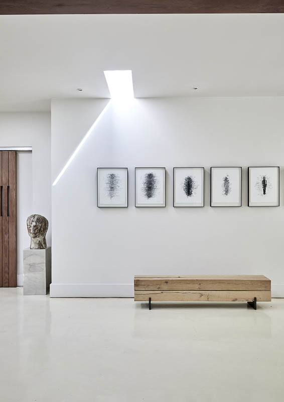
A white gallery runs the length of the house, dividing the more social or “public” living area from the private bedroom wing. The gallery has no windows, but a series of irregularly dispersed skylights punched into the ceiling let in beams of light from above, which move throughout the day (and the seasons) becoming a sculptural element in the gallery in their own right. The artworks are by Lehlogonolo Mashaba and the sculpture is by Wilma Cruise. The bench is from Weylandts. In the last image (8), the artworks on the living room wall are by William Kentridge and Maja Maljevic, and the dachshund sculpture, wound in dip-dyed bandages, is from Egg Design.
Bureaux House Moffatt 9-13
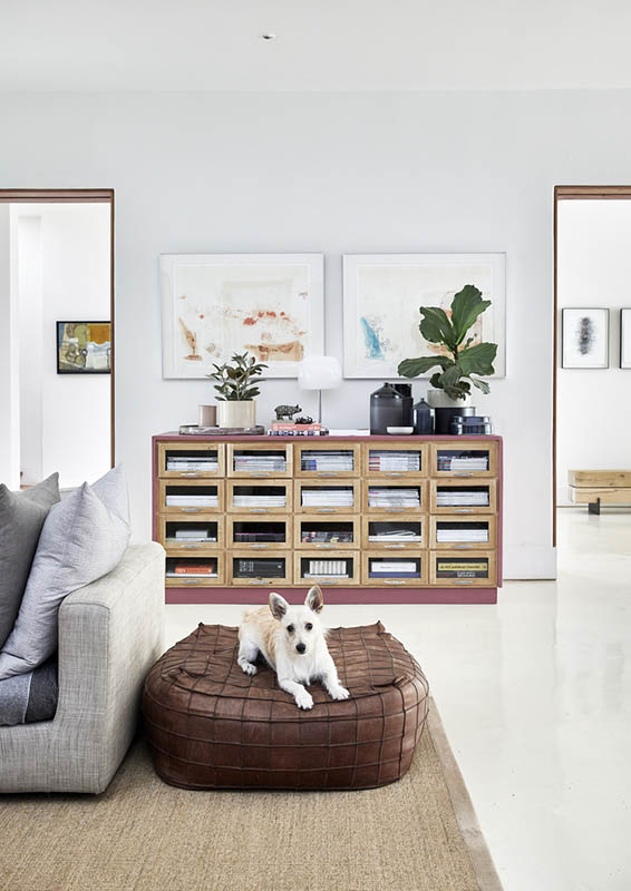
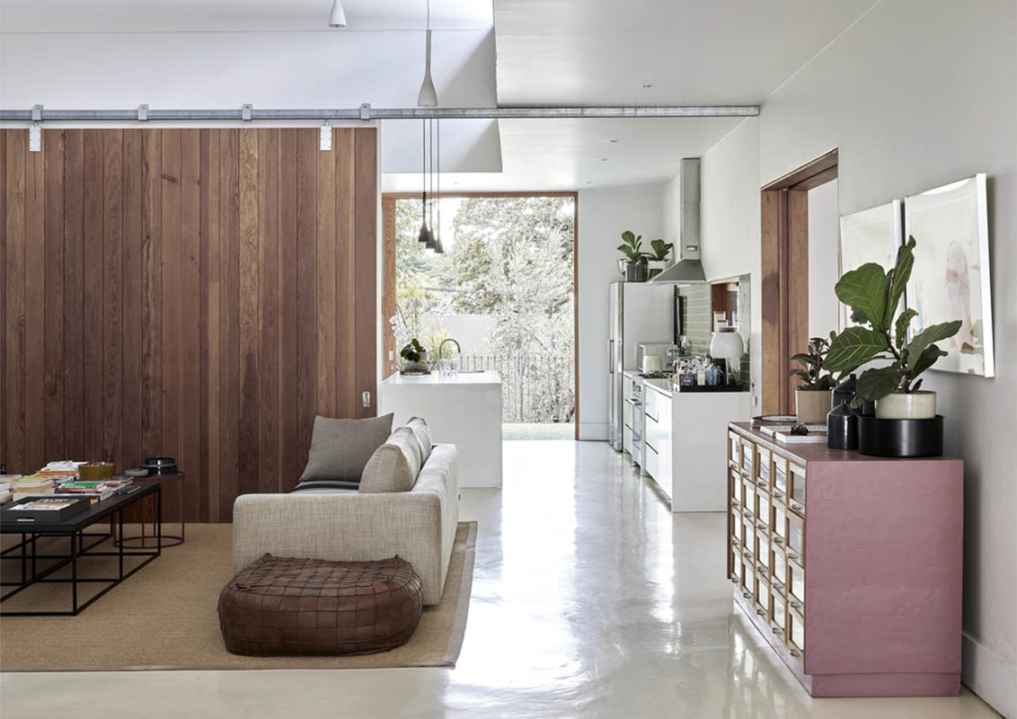
In the living area, a vintage haberdashery shop cabinet has been modernised with a lick of paint. Its drawers have been filled with magazines. The artworks above are by Serbian-born, South African-based artist Maja Maljevic. The sofa is from Tonic Design. The white lamp is from Spazio Lighting. The ceramics include pieces Marc and James have collected on their travels abroad.
Bureaux House Moffatt 14-18
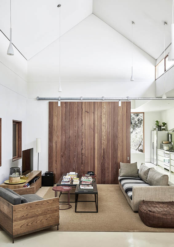
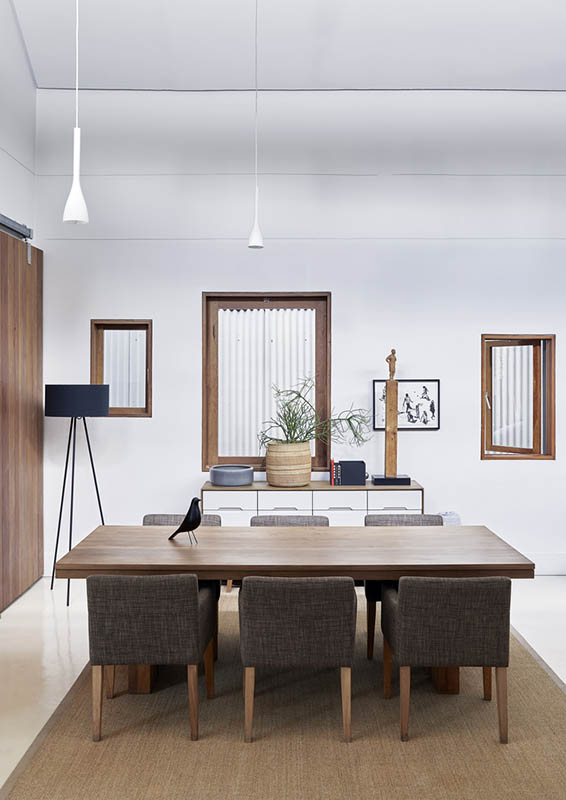
An informal TV room between the mint-green kitchen and the dining room is demarcated with a sisal rug. The sofa is by Tonic Design, as is the armchair and the red circular side table. The modular coffee table is from Wunders. The television cabinet is by Mezzanine. The volume in the living areas is one-and-one-third, which architect Kate Otten finds a much more pleasing proportion than double volume. The clean pitched ceilings create a sleek simplified barn-inspired shape, so that the external form can be “read” from the inside. Clerestory windows let north light into the deep space of the barn, preventing it from becoming cold or dark. James and Marc love using the old school-style window hook on a long pole to open up the windows. The top-hung sliding doors in this wing of the house create a flexible, interactive space that can be divided and connected in multiple ways. James points out that in winter, particularly when the fireplaces are lit, they still fill the rooms with a subtle pine scent.
Bureaux House Moffatt 19-24
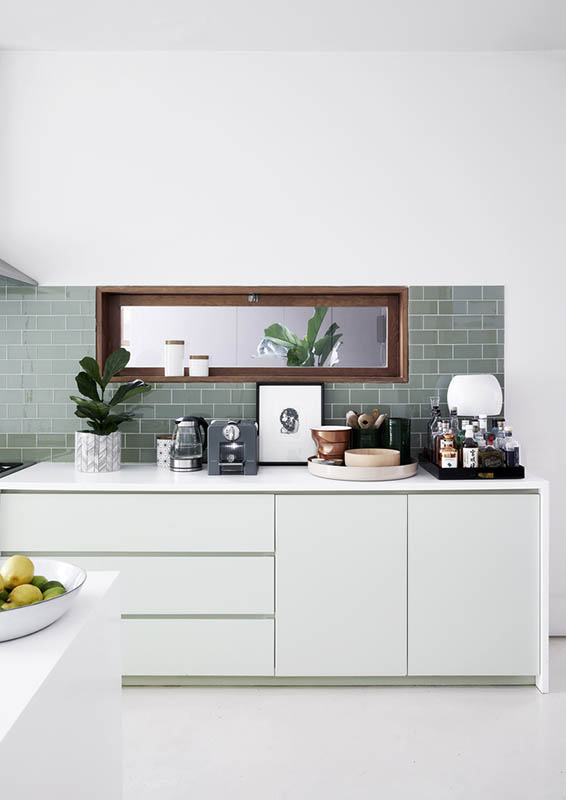
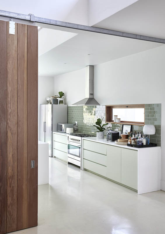
The mint-coloured kitchen cabinetry is by Bloxam Woodwork. The kitchen opens onto a grassy courtyard. The sliding doors reach all the way to the ceiling, as they do everywhere throughout the house. The muted mint shade of the cabinets have surprisingly bright red interiors like the underside of the concrete slab in the entrance courtyard – a design detail added by Kate to offset the neutral palette. An eye-level hopper window opens onto the landing at the top of the stairs at the entrance of the house.
Bureaux House Moffatt 25-26
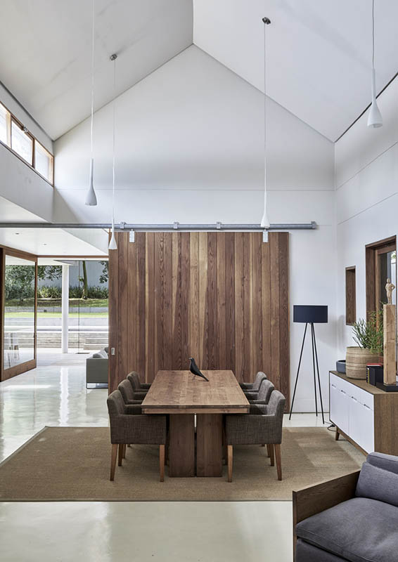
The dining room-table and chairs are from Weylandts and the cabinet is from Mezzanine.
Bureaux House Moffatt 27-31
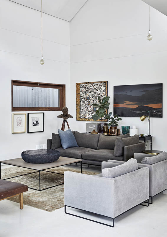
In the lounge, the sofa, armchairs and coffee table are all from Tonic Design. The daybed is by Mezzanine Interiors. The table lamp in the background is a Lab Light by Anatomy Design. The artworks in this room include works by MJ Lourens, Sharle Matthews and Nelson Makamo and William Kentridge. The head sculpture is by Louis Olivier. The eye-level window is positioned to let in north light. The lounge opens onto the large, park-like garden.
Bureaux House Moffatt 35-37
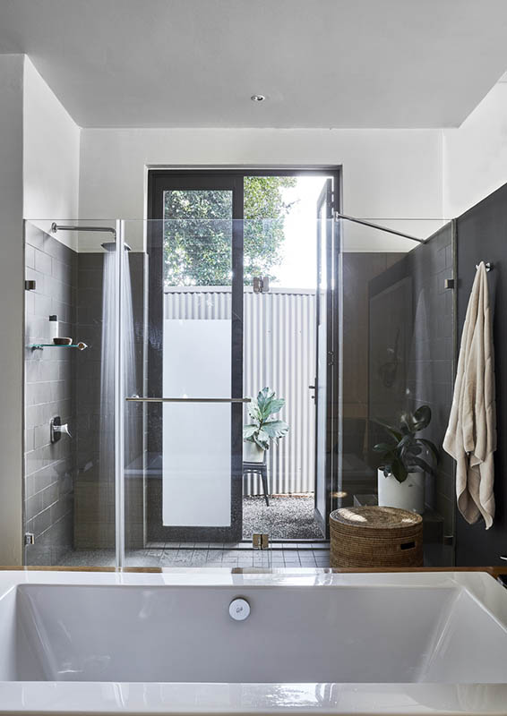
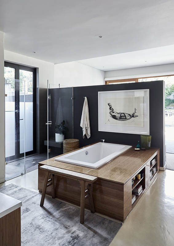
The en-suite bathroom features a beautiful bath surround by integrated shelves. The built-in cupboards have been specifically detailed that they don’t reach all the way to the floor. The artwork above the bath is by Deborah Bell and the brightly coloured print at the entrance to the bedroom is by Wopko Jensma.
Bureaux House Moffatt 38-40
The bed in the main bedroom is by Tonic Design. An artwork by one of James and Marc’s favourite artists, MJ Lourens, hangs above it. The brightly coloured print at the entrance of the bedroom is by Wopko Jensma. On the bedside table, a Tizio Lamp by Richard Sapper creates a pleasing dialogue with the telephone poles in the artwork above it. The courtyard directly outside the bedroom has been paved with slim rectangular concrete pavers and crushed stone. Ceramics and artworks on the floating shelves include items by Sue Pam-Grant, Anatomy Design and Mezzanine.
Bureaux House Moffatt 41-44
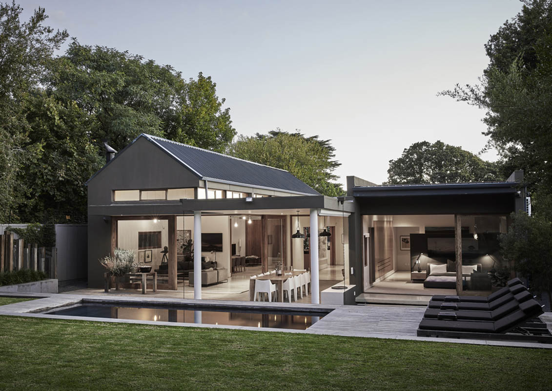
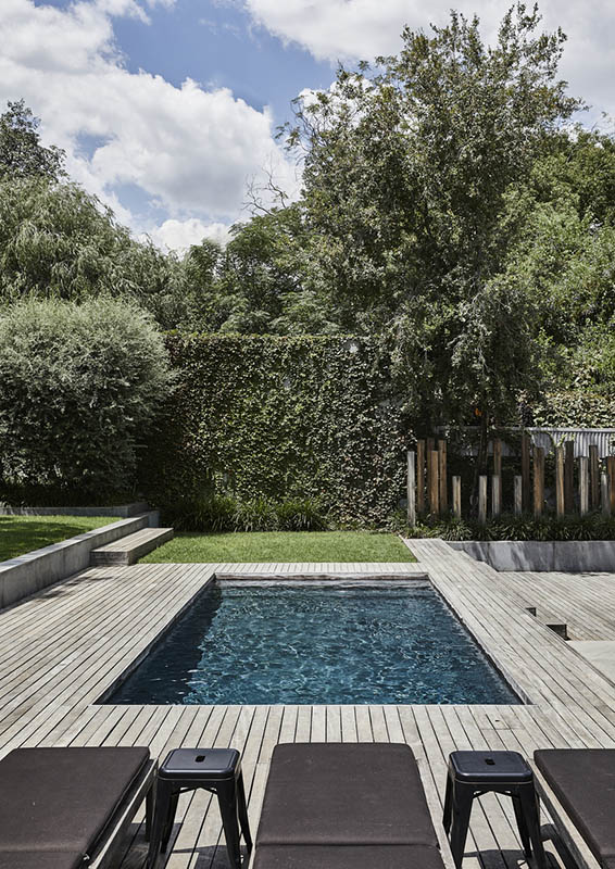
Seen from its park-like gardens, looking over the Garapa deck and swimming pool, the essential structure of the house can be read in its exterior shape: the gallery down it’s centre, the barn-like social area to one side, and the more enclosed, intimate private bedroom wing to the other. The large glass sliding doors open the house to the garden, which blurs the distinction between indoor and outdoor space in summer, but can be closed off to keep it warm and cosy during winter. The house is nestled among established trees, its graphite exterior accentuating the greenery and absorbing the glare of the harsh South African sun.

© Copyright 2021 – Homes.mu by Eclipse Investments | Design with ❤ by Mataora.com
Soyez le premier à recevoir les nouveautés de Homes Magazines directement dans votre boite email.